The Big 10 House


Project Details
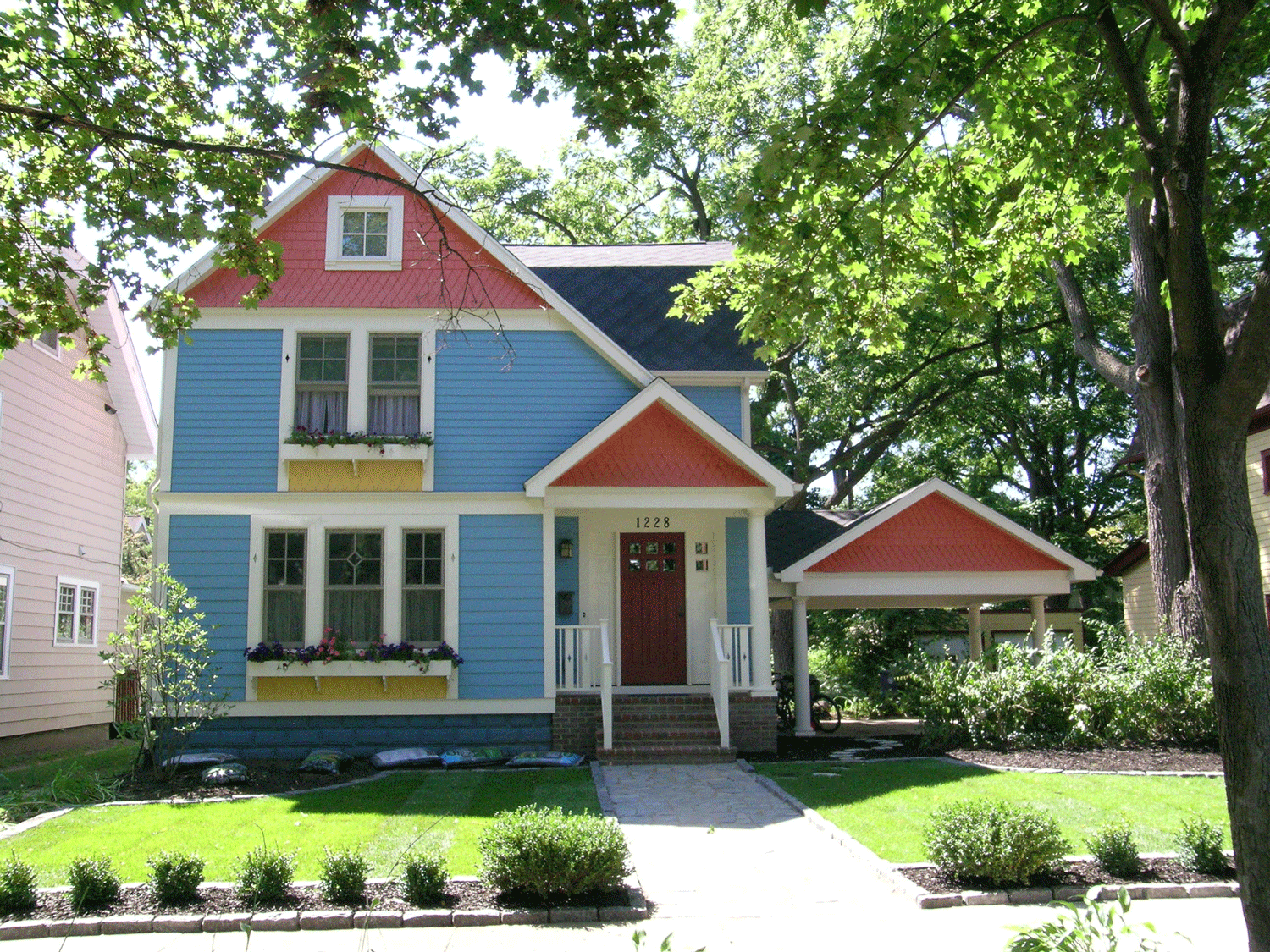
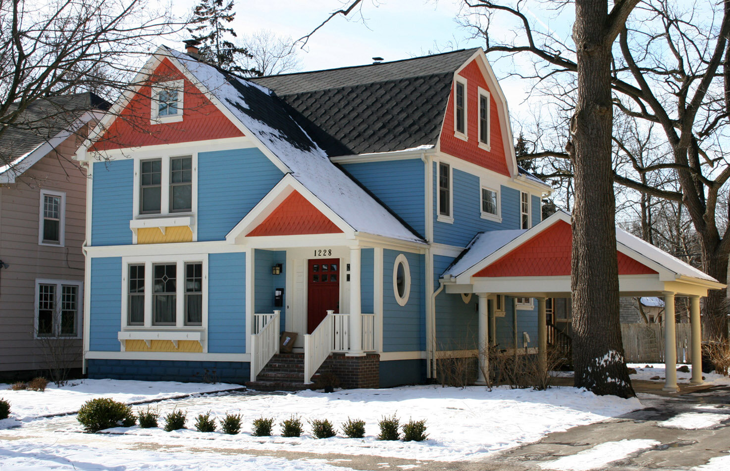
A deteriorating carport was replaced with a design that fits much better with the house
The exterior of the home was redone with new siding, an enlarged porch, and all new windows
The owner’s son selected a “Big 10” color scheme
The owners of this home were concerned that their carport was deteriorating, and they did not like the wide, plain siding on their home or the flatness of the facade. They also wanted to enlarge the foyer and reconfigure the front porch. The homeowners decided to replace almost all of the windows with new, energy-efficient windows. Studio Z added interest to the house through the use of different types of siding, contrasting trim bands, and gingerbread. Every detail was considered, including the window mullion patterns, the diamond cutouts in the window trim and porch railings, and the patterns and widths of siding.
The colors for the home were selected by the owners’ son, who wanted to use maize and blue (in honor of the local Big 10 University). The owners worked with interior designer, Kim Weder, to select the actual colors.
Credits
Contractor: Dennis Boychuck Inc.
Structural Engineer: SDI Structures
Photographers: Studio Z Architecture and Steven J. Norton
Color Consultant: Kim Weder, Kimberly Weder Designs

