Replacing an Old Addition
Project highlights:
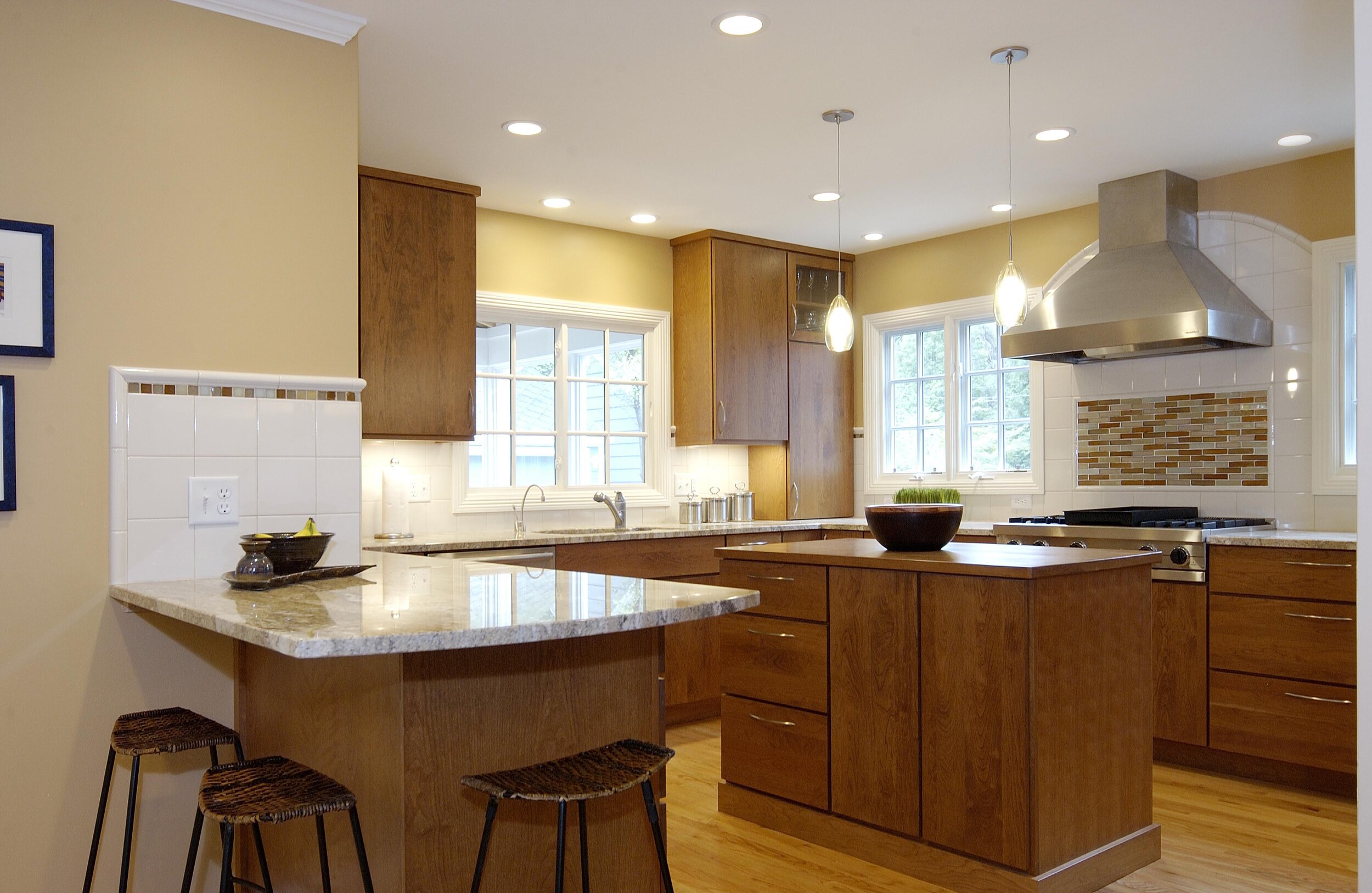
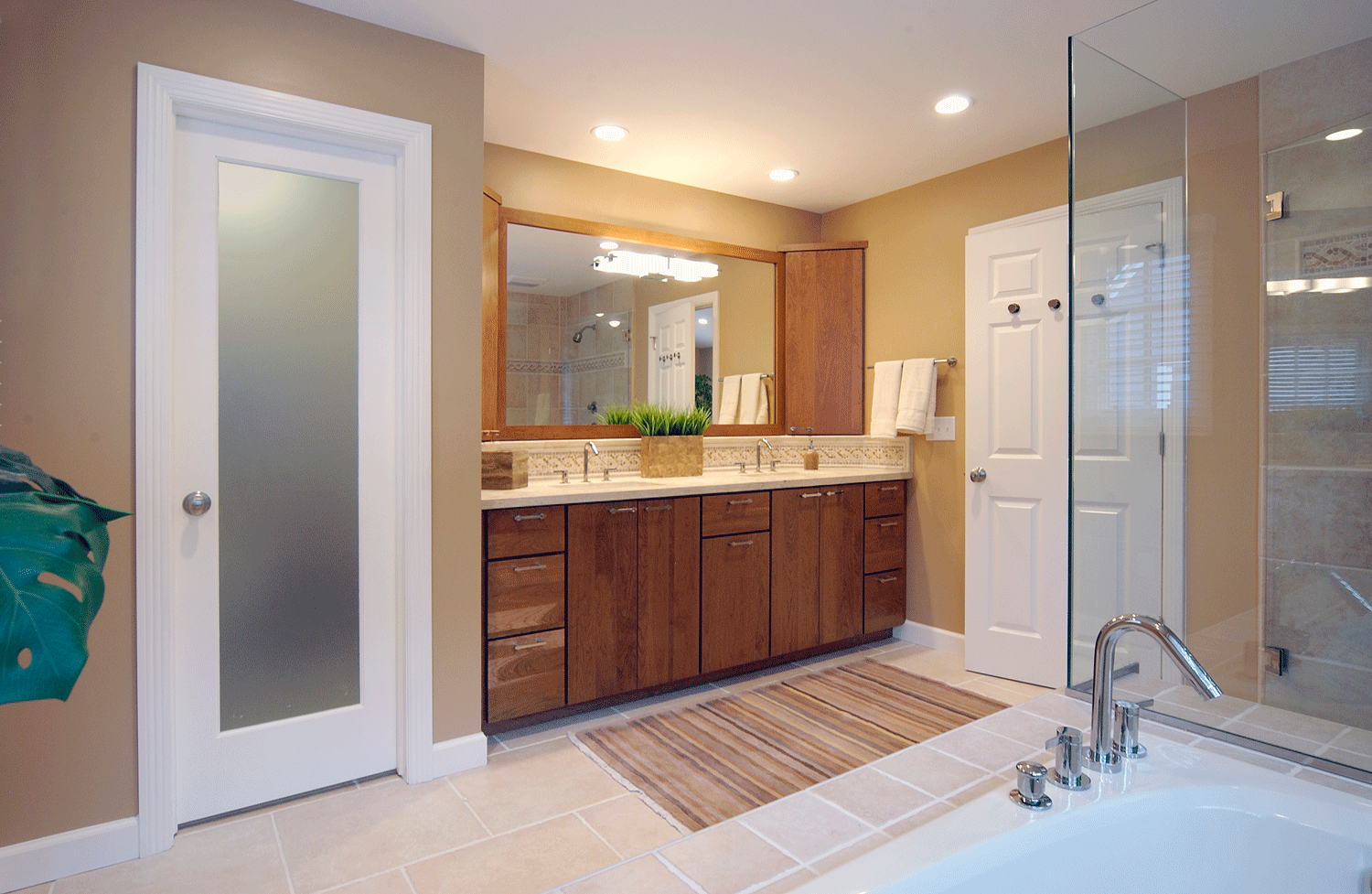
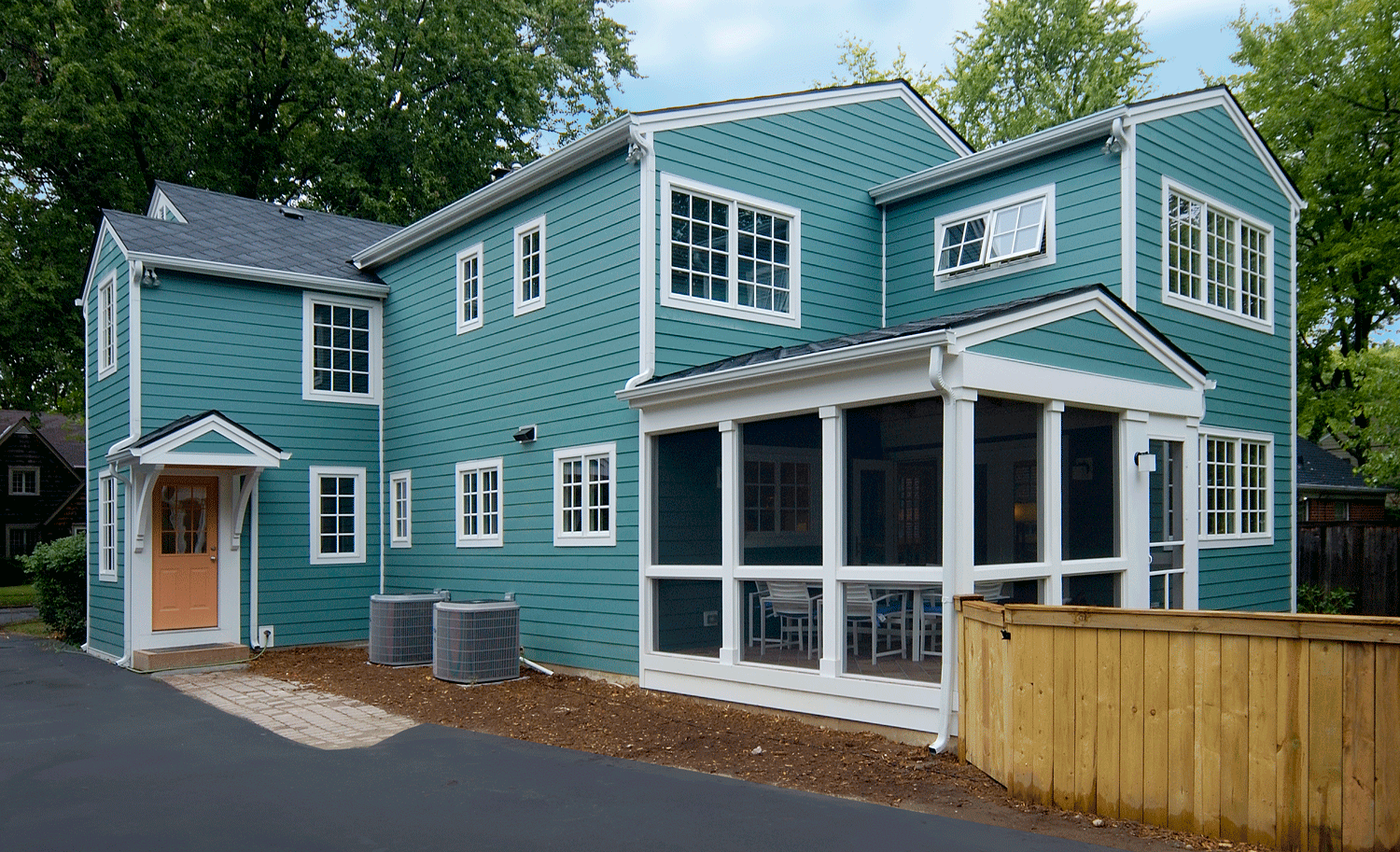
An addition that was built in the 1970s was torn down and replaced with a new addition containing a kitchen, family room, dining room, and screened porch on the first floor, and a primary suite on the second floor
The basement was enlarged by building the new addition on a basement
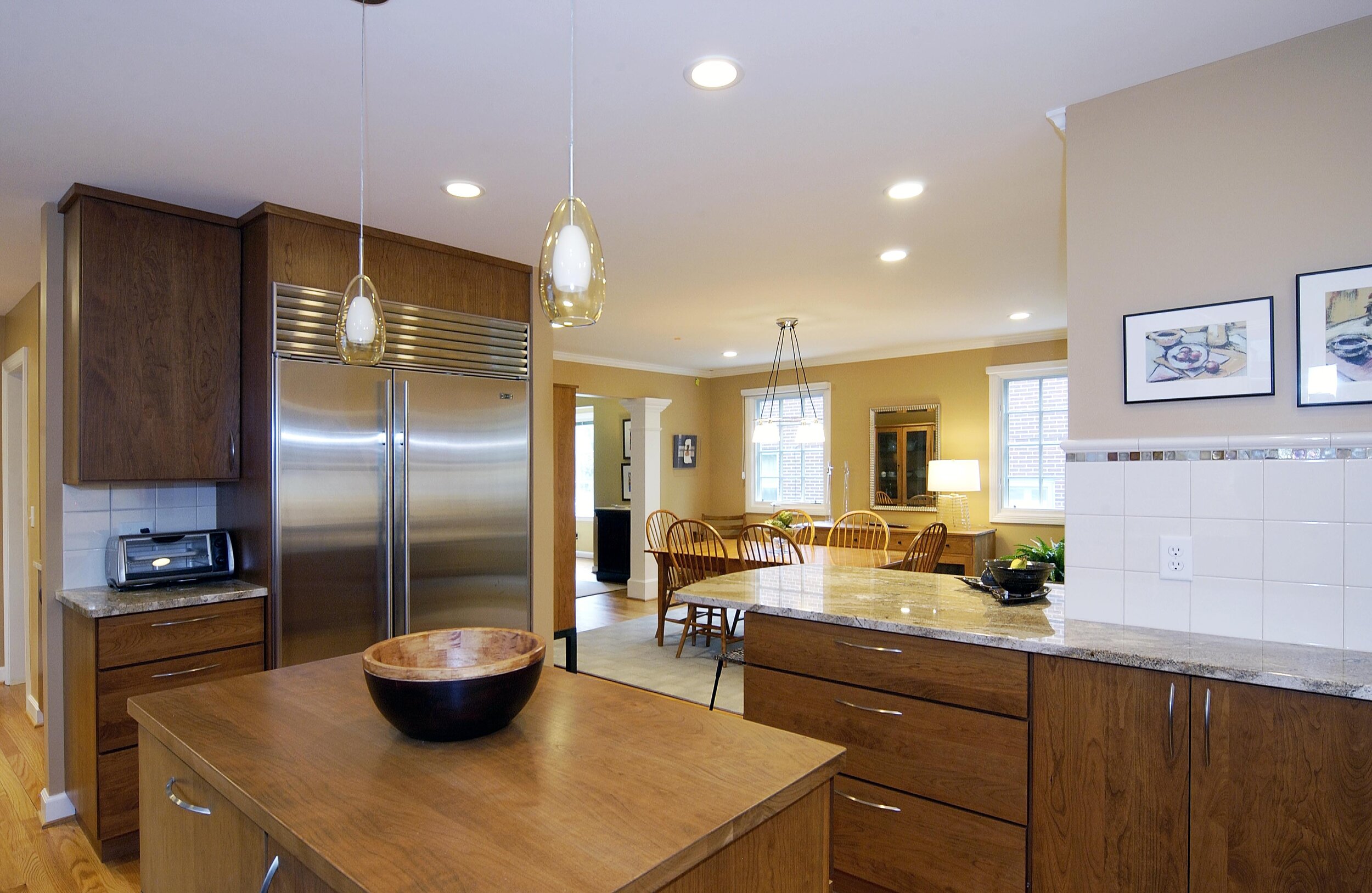
The kitchen was moved to the back of the addition so that it could be out of the main circulation path into the house
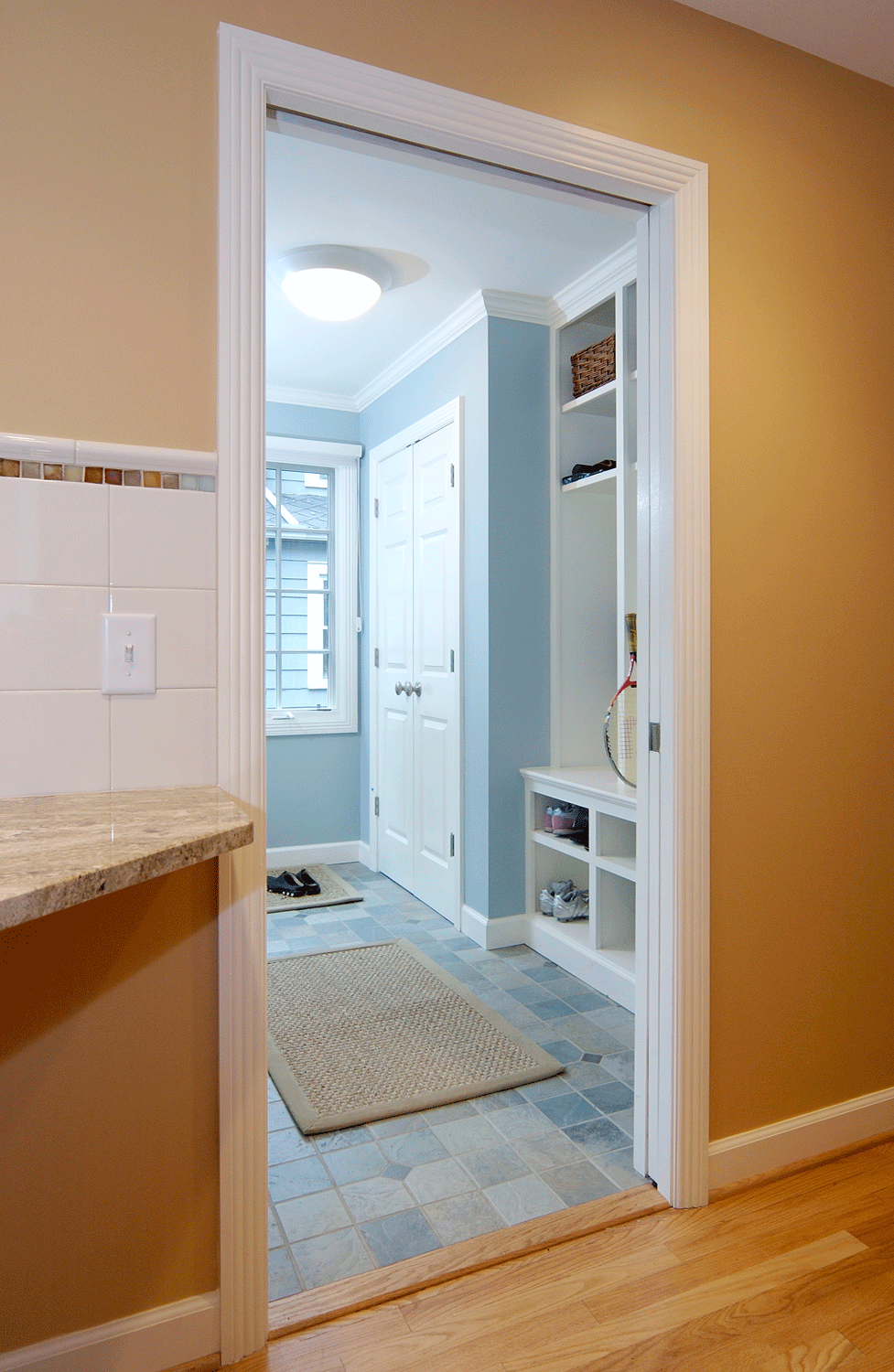
The old kitchen became a spacious mud room
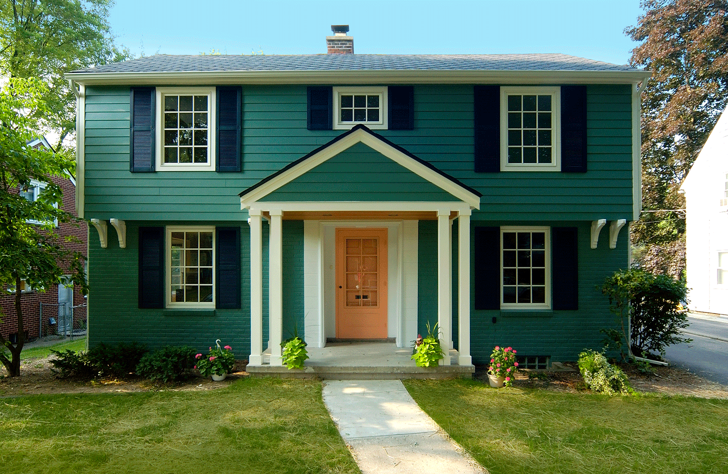
A covered porch was added to the front of the house
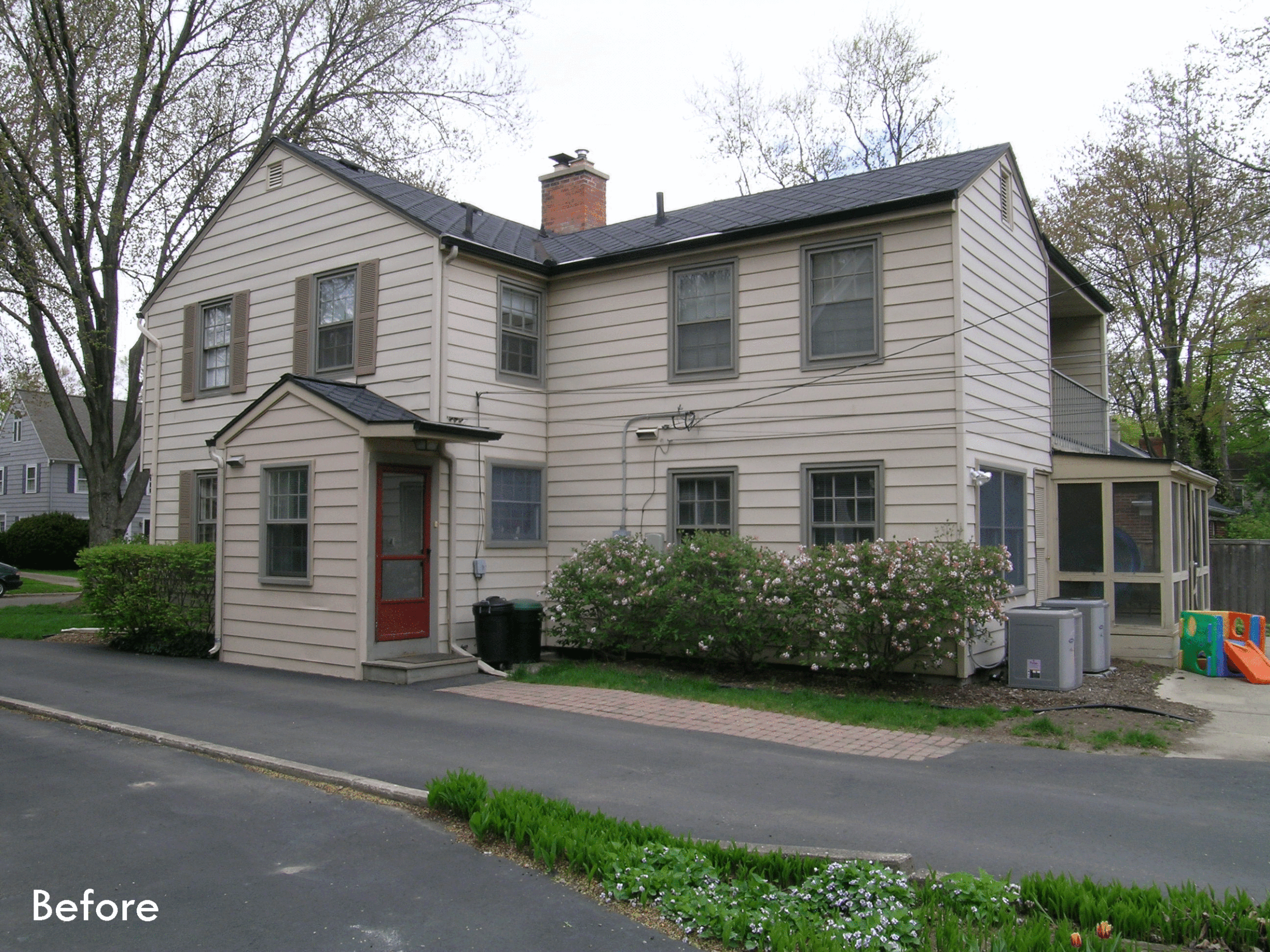
The owners of this 1940s home loved the character of the original part of the house, but the addition that was built in the 1970s was less than charming.
The kitchen was L-shaped, and opened directly to a tiny mud room. When the kids walked through the kitchen with their backpacks and sports equipment, they would bump the knobs on the front of the range and inadvertently turn the burner on. Of course, the owner soon removed the knobs from the stove.
The 1970s addition contained a dining room, a family room, and a small screened porch on the first floor, and a primary bedroom and bathroom on the second floor. The family room was separated from the original living room with a set of bi-fold doors, which didn’t look very nice and didn’t prevent sound from traveling between the two rooms.
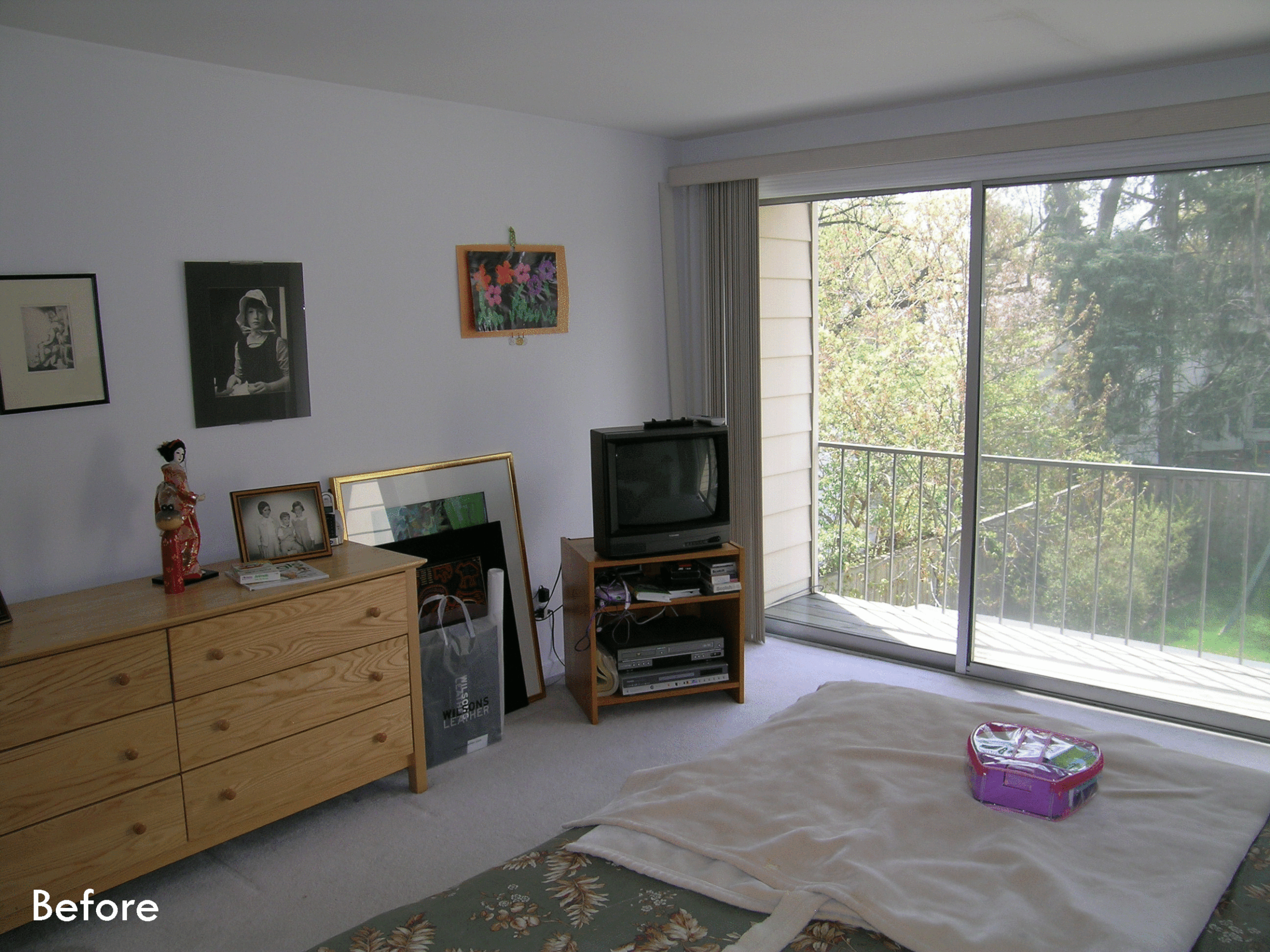
Upstairs, the primary bedroom had a three-panel sliding door at one end that opened to a tiny balcony, which made the room feel like a hotel room. The primary bath was tiny and the fixtures were very dated. The roof over the primary bedroom was almost flat and the owners reported that it leaked frequently. Finally, the old addition was built on a crawl space, so the home’s basement was fairly small.
After much discussion, the homeowners decided to tear down the 1970s addition and build a new, larger addition in its place. The addition would be built on a basement that was even deeper than the existing basement, which allowed a higher ceiling for the family’s activities. The new part of the basement included an egress window, which not only allows easy escape in the unlikely event of a fire, but also lets daylight into the basement.
On the first floor, Studio Z repurposed part of the old kitchen to form a spacious mudroom with a cubby for each member of the family to store their backpacks, coats, and boots.
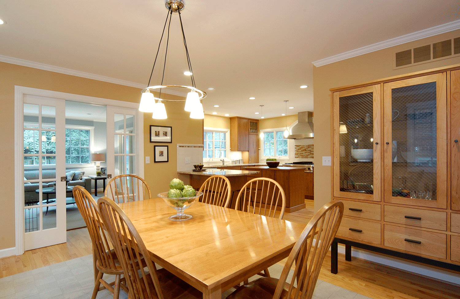
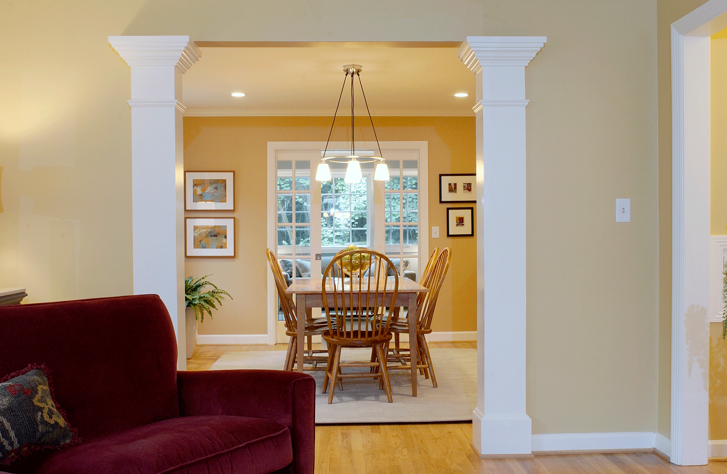
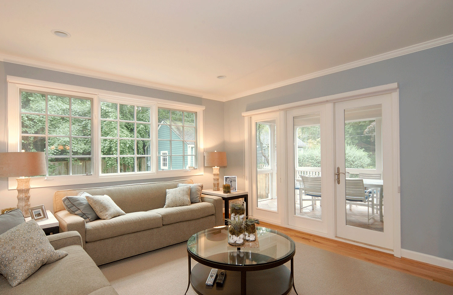
Studio Z proposed moving the kitchen to the addition, where it could be a U-shaped space with no through traffic. The kitchen opens directly to a new dining room which serves the family on a daily basis but is nice enough for more formal entertaining. Behind the kitchen, Studio Z designed a cozy family room with French pocket doors that can be closed if needed for noise separation. The family room opens directly to a screened porch, which features a serving window directly to the kitchen.
On the second floor, Studio Z designed a modern, spacious primary suite, enlarged the kids’ bathroom, and added a small area to an existing bedroom above the old mud room.
Outside, Studio Z designed a covered front porch. All of the windows in the existing part of the home were replaced, and new fiber cement siding was installed.
Credits:
Contractor: David Klein Construction
Structural Engineer: SDI Structures
Interior Designer/Exterior Color Consultant: Kim Weder, Kimberly Weder Designs
Photographer: Gary Easter


